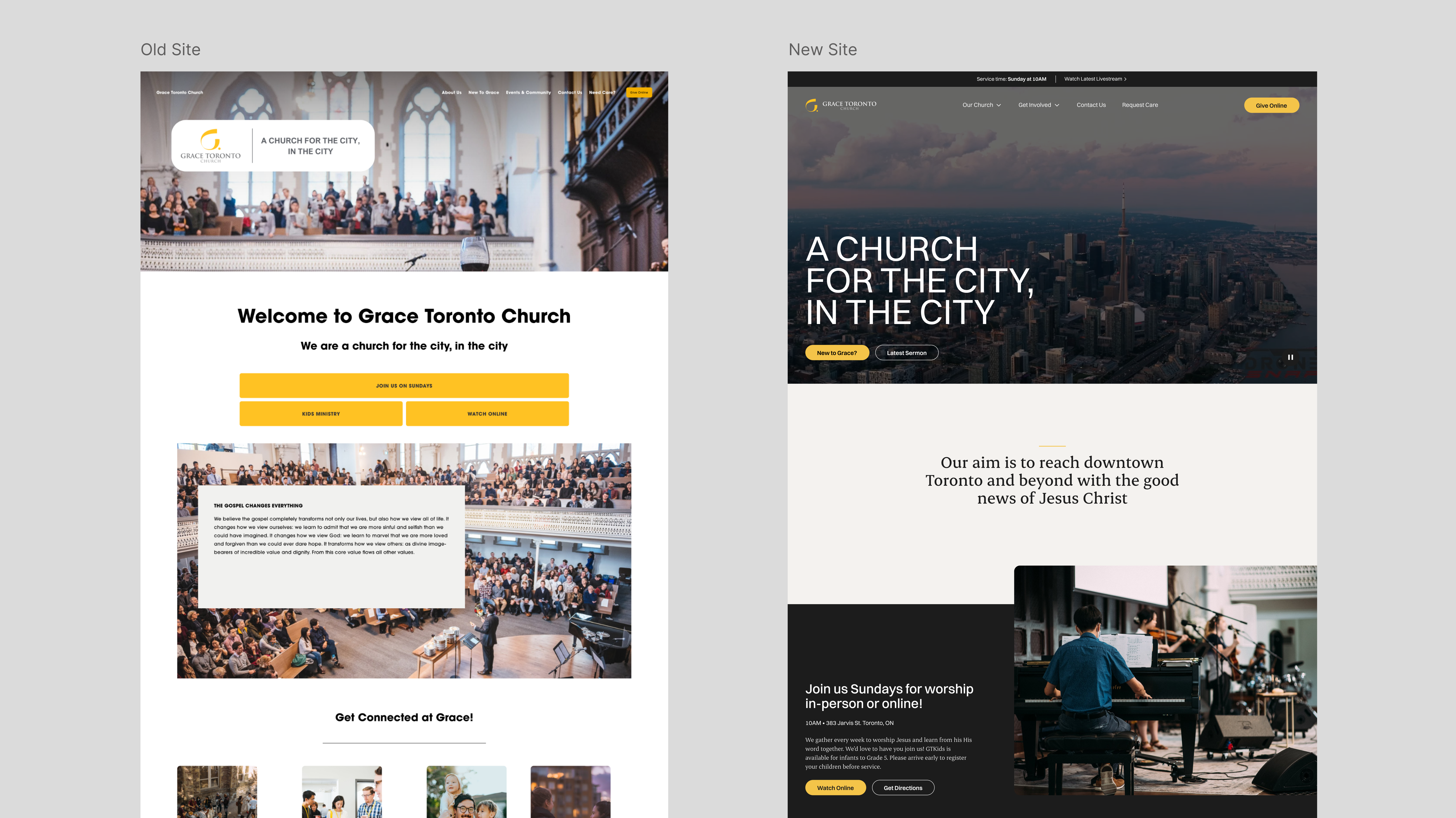
Figure 01 — Before/After Homepage Comparison
The Brief
Before any design work began, I defined three pillars that would frame every decision made
throughout the project.
Efficiency. How could the site make it faster and easier for regular attendees to complete
their most common tasks? Getting to the sermon library, finding event information, accessing
the donation platform, and locating staff contacts were all taking more steps than they should.
Outreach. How could the site better serve people who were encountering Grace Toronto for the
first time? Whether someone was searching for a new church or simply curious about Christianity,
the website needed to answer their questions clearly and make a genuine first impression.
Design. How could the site visually reflect the feel of Grace Toronto Church? The church had a
distinct character that had potential for better visual expression.
These three pillars were defined upfront and presented to stakeholders before research began,
ensuring that every subsequent decision had a clear framework to be evaluated against.
Research
Before opening Figma, I needed to understand what was actually broken. I designed and
distributed a survey to the Grace Toronto congregation, targeting two distinct user groups with
separate question flows: regular attendees and staff members. The survey received 31 completed
responses from a representative sample of both staff and congregation members, with an
additional 48 partial submissions.
The questions covered five areas: navigation and task completion, events and announcements,
ministry content, newcomer experience, and design perception.
Four clear themes emerged from the responses:
Navigation friction was the most consistent pain point. Multiple respondents described needing
too many clicks to reach frequently visited pages. One attendee had the bulletin URL memorized
because the path through the navigation was too cumbersome. Another noted that shorter direct
URLs like /give, /bulletin, and /about would meaningfully improve their experience. The events
page, one of the most visited sections, required several clicks to reach from the homepage.
Events and announcements were not surfaced prominently enough. Respondents consistently noted
that significant church-wide events like conferences and seasonal gatherings were buried at the
same visual level as routine weekly announcements. Several suggested a dedicated calendar view
with filtering by ministry type. One respondent noted that a major conference should be
highlighted on the front page rather than appearing as just another item in a list.
The brand felt undefined and templated. A staff member wrote directly that they did not feel a
brand had been defined. Others noted the site felt visually inconsistent across ministry pages,
with no clear design system tying everything together. The stock photography and default
Squarespace layouts were frequently cited as misaligning with how respondents actually
perceived Grace Toronto as a community.
The site was not serving newcomers well. When asked what they would expect to find on a church
website before deciding to attend, respondents consistently cited doctrine, service times, staff
bios, and ministry information. Several noted that a broken statement of faith link was their
first experience of the site. One respondent noted the site simply did not do enough to draw
you in.
These findings directly shaped the three pillars the project was built around. Efficiency:
reducing friction for common tasks. Outreach: serving newcomers who do not yet know the
community. Design: building a visual identity that truly reflects Grace Toronto.

Figure 02 — Survey Highlights and Representative Quotes (Placeholder)
Research made the core issue impossible to ignore: people were not struggling to understand content, they were struggling to find it.
Information Architecture
With the research findings in hand, the next step was restructuring how the site was organized
before touching any visual design. The old Squarespace site had grown organically without
deliberate planning, meaning pages were added as needs arose. This resulted in a navigation
that reflected the church's internal organizational structure rather than how a visitor or
attendee would actually look for things.
I audited every existing page, then identified every page that needed to exist. I reorganized
these into a new structure built around user intent rather than internal church departments. The
revised IA covered fifteen top-level navigation categories, each with clearly defined sub-pages.
To bring clarity to the complexity of the site, I developed a colour coding system in Figma to
distinguish between different page types at a glance.
A few structural decisions were deliberate responses to what the research surfaced. Ministries
were given their own top-level section with individual pages for each group, rather than being
buried under a generic dropdown. A dedicated Serve on Sunday section addressed the volunteer
pathway that respondents had noted was hard to find. A Need Care section surfaced pastoral
support pathways that previously had no clear home in the navigation. The Give page was
elevated to a top-level item with a direct URL, addressing the feedback that donation access
required too many steps.
The revised structure was presented to the two primary stakeholders, the website manager and
the church executive director, alongside a summary of the research findings. Both approved the
direction before any visual design work began.
Figure 03 — Colour-Coded Information Architecture Map (Placeholder)
Restructuring navigation around how people actually look for things turned a maze of internal categories into a path that feels obvious.
Visual Direction
The visual design brief emerged from the character of Grace Toronto itself rather than from
conventions about what a church website should look like.
The building occupies a 200-year-old heritage structure on Jarvis Street, but the interior is
modern, white, and clean. The Sunday service blends traditional liturgy with contemporary
worship. The congregation skews young but spans a wide age range. There is a specific tension
at the core of the community: historic and rooted, but also alive and current. I wanted the
website to hold a bit of that same tension, incorporating subtle hints of traditionalism while
still taking on a clean, modern feel.
That tension shaped the typographic system directly. Switzer Variable carries almost the entire
site, a clean and contemporary geometric sans-serif that reads as confident and urban. Erode
Variable is used sparingly, only at the Display Title level, for moments where the design
needs a sense of weight and heritage. A serif headline used once on a page lands differently
than one used everywhere, and so the restraint was very intentional.
The inspiration collected before starting design was deliberately outside the church website
category. Princeton University Press, Harvard institutional sites, Desiring God, and Ramp were
all on the board. What those references share is that they take typography and layout
seriously, treat whitespace as a clear design decision, and most importantly let content lead
rather than decoration. Most church websites do not execute on these things, but I wanted the
Grace Toronto site to have a clear sense of craft to it.
On the topic of content-first, photography was a central design decision that carries the whole
site. The old Squarespace site relied on stock imagery, which contributed significantly to the
templated and generic feeling respondents described. The new site was built around real
photography of the congregation and building. These images show what it actually feels like to
be at Grace Toronto. The homepage takes this further with a full-page video background as the
hero, showcasing a compilation of different elements of a Sunday service at Grace.
Motion and interaction were also considered deliberately. Swup.js was implemented to create
seamless page transitions so the site did not feel like a collection of separate pages
reloading, and you can feel how smooth and fluid it is when navigating between pages. Subtle
animations throughout were kept understated, but also helped deliver that fluid feeling.
Figure 04 — Inspiration Board and Typographic Direction (Placeholder)
Design System
The visual design was built on a token-based design system defined entirely in Figma before
development began. Typography, spacing, colour, and border radius were all defined as named
tokens with responsive values across desktop, tablet, and mobile breakpoints. There are twelve
spacing increments, three radius sizes, and a colour system built around semantic naming rather
than raw hex values.
The colour palette is restrained, primarily using greys and accent colour. Grace Toronto's only
existing brand asset was its gold accent, carried across the logo and various church materials.
Rather than expand the palette or move away from it, I kept the gold but used it sparingly:
the logo, button backgrounds, and small accent lines only. As a result the site reads mostly
neutral and typographic, with the brand colour appearing as subtle punctuation.
The system was also architected with sub-brand flexibility in mind. Imprint Magazine and
GraceArts, two ministry arms of Grace Toronto, each have their own accent colour defined within
the same token structure. The underlying system is shared across all three, with only the
accent colour swapping per brand. While these sub-brand themes were not ultimately deployed,
defining them upfront meant the system was architecturally ready to support future sub-brands.
Figure 05 — Type Scale and Colour Tokens from the Design System (Placeholder)
Figure 06 — Spacing and Layout Tokens (Placeholder)
The build had to feel like a custom product while still remaining editable by non-technical staff after launch without developer support.
Build
Once the design system and high-fidelity mockups were approved by stakeholders, I moved
directly into development, handling every aspect of front-end implementation without a separate
developer.
Webflow was the primary build environment, chosen for two reasons. First, it allowed
implementation with the level of visual precision that a custom-coded site would provide,
without the overhead of building a CMS from scratch. Second, and more importantly for a church
staff without technical backgrounds, Webflow's CMS editor meant that once the site launched,
content like sermons, events, announcements, and staff profiles could be managed entirely by
non-technical staff through a simple editing interface. The design system built in Figma
translated directly into Webflow's CSS style system, keeping the implementation consistent with
the source of truth.
Several features required going beyond what Webflow natively supports. Custom JavaScript,
hosted in a GitHub repository and loaded into Webflow via script tags, handled functionality
the platform could not provide out of the box. Other custom interactions included
micro-animations, dynamic content filtering, and various UI details that would have been
impossible to achieve within Webflow's native interaction tools.
Page transitions were handled using Swup.js, a lightweight JavaScript library that intercepts
navigation between pages and animates the transition rather than triggering a full page reload.
This was one of the earliest decisions made about the site's feel. Some of my favourite
inspiration are sites that utilize PJAX page transitions to keep the experience feeling
continuous. On a site with as many sections and sub-pages as Grace Toronto, that fluidity truly
changes the quality of the browsing experience.
The result was a site that behaves like a custom-built product while remaining fully
maintainable by non-technical staff, a constraint that shaped every build decision from the
beginning. The full project, from initial research through to public launch, spanned roughly
six months, completed entirely outside of regular working hours alongside my full-time
employment.
Figure 07 — CMS Editing Experience and Transition Motion Study (Placeholder)
Outcome
The redesigned Grace Toronto website launched in 2023 and has been the church's primary digital
presence for over two years. In that time it has served 43,000 active users in its first full
year, with 38,000 active users recorded in the current year to date (as of July 2026).
The site runs on a CMS that non-technical staff manage independently, covering sermons, events,
announcements, staff profiles, and ministry pages (none of which require developer involvement
to update).
Events were one of the most consistently raised pain points in the research, with respondents
asking for a dedicated calendar view. In practice, a traditional calendar grid did not make
sense as Grace Toronto runs enough concurrent events across ministries that individual entries
would have been illegible at grid scale. Instead of a calendar, a custom event listing page was
built with robust filtering (by ministry and event type), with preview cards that surface all
essential information. Major events and conferences are featured prominently on the homepage
through a dedicated blog-style section, directly addressing the feedback that significant events
were getting lost among routine announcements.
The custom JavaScript codebase hosted on GitHub has since grown into a shared resource, with a
small development team now contributing alongside the original implementation.
Figure 08 — Final Site Mockup and Events Experience (Placeholder)
The website solved a major digital problem, but it also revealed a larger truth: without a full brand system, consistency will always drift over time.
Reflections
Looking back now, the build would have benefited from a developer collaborator from the start.
Handling both design and front-end implementation meant that complex JavaScript interactions
consumed time and attention that could have gone toward design quality. The custom JS codebase,
while functional, grew organically rather than architecturally, something the newly formed
development team is now working to address. Bringing in a developer earlier would have produced
cleaner code and likely a faster build.
Maintainability without me was underdesigned. The visual system exists in Figma and the design
intent is clear, but when new pages are built by staff without design involvement, there is no
CMS component library in Webflow that enforces the design system at the point of content
creation. Page quality has drifted since launch in ways a more robust component library or web
platform would have prevented. Starting again, I would invest more time upfront in building a
constrained component system that made it structurally difficult to produce off-brand pages.
The project also took longer than it needed to. Six months for a site of this scope was
reasonable, but the build phase in particular could have been more efficient with better process
discipline around page templating and reusable component structure.
The reflection I keep returning to is about scope. The website helped elevate Grace Toronto's
digital presence, but the broader brand did not come with it. Social media, presentation
slides, livestream graphics, the bulletin, printed materials, and signage all operate
independently with inconsistent design. The website exists as a well-considered island within a
fragmented visual ecosystem. What the church actually needed was not just a website redesign but
a full brand identity system applied consistently across every medium. That was not the brief,
and was not something one person could have delivered as a volunteer project, but understanding
that gap changed how I think about design scope and the relationship between digital and
physical brand touchpoints.
Webflow itself was the right tool for this project given the constraints, but its limitations
became more apparent to me over time. The gap between what is achievable in Figma and what is
achievable in Webflow without custom code is wider than the platform implies, and for a project
with this level of design ambition, a custom-coded front-end would have provided more
flexibility and cleaner output.